The useful boundary is buried.
“Custom order details” is accurate, but generic. The distinctive moment is the handoff from Shopify’s order screen to someone engraving, printing, sewing, or assembling a real object.
BenchCue already had a coherent page and visual system. The pass does not propose decoration for decoration’s sake. It identifies the one idea that should become harder to miss: this software exists at the boundary between a digital order and a physical bench.
“Custom order details” is accurate, but generic. The distinctive moment is the handoff from Shopify’s order screen to someone engraving, printing, sewing, or assembling a real object.
The current hero shows that the extension exists. It does not yet let a maker feel the relief of carrying one clean instruction sheet to the bench.
“See the workflow” is appropriate while App Store review is pending. At launch, the hero should name Shopify immediately and let qualified merchants recognize themselves before asking them to study the process.
The visual direction keeps BenchCue’s warm workshop palette, but makes the production handoff the central image. This is a direction study for the early page—not a claim that unmeasured conversion improved.
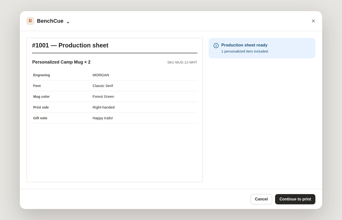
BenchCue pulls the item, quantity, SKU, and public customization choices into one maker-ready production sheet.
ORDER → CUE → MAKE
This is a qualitative visual-direction study of a Revert Creations product. It uses no private analytics, customer research, or conversion experiment. It does not prove that the proposed direction will sell more. Its job is narrower: make a defensible idea visible enough to build and test.
Your page would receive the same four-part treatment, using its real offer and material.
Buy one Character Pass · $275 →